The goal: DoorVault should feel simple on day one and powerful on day 100. Our old sidebar made that hard. Here is what we changed and why.
The Problem: Too Many Doors
When we launched DoorVault, every feature got its own menu item. Transactions. PM Statements. Reconciliation. Equity Tracker. Section 8. BRRR Tracker. Documents. Email Inbox. The list kept growing.
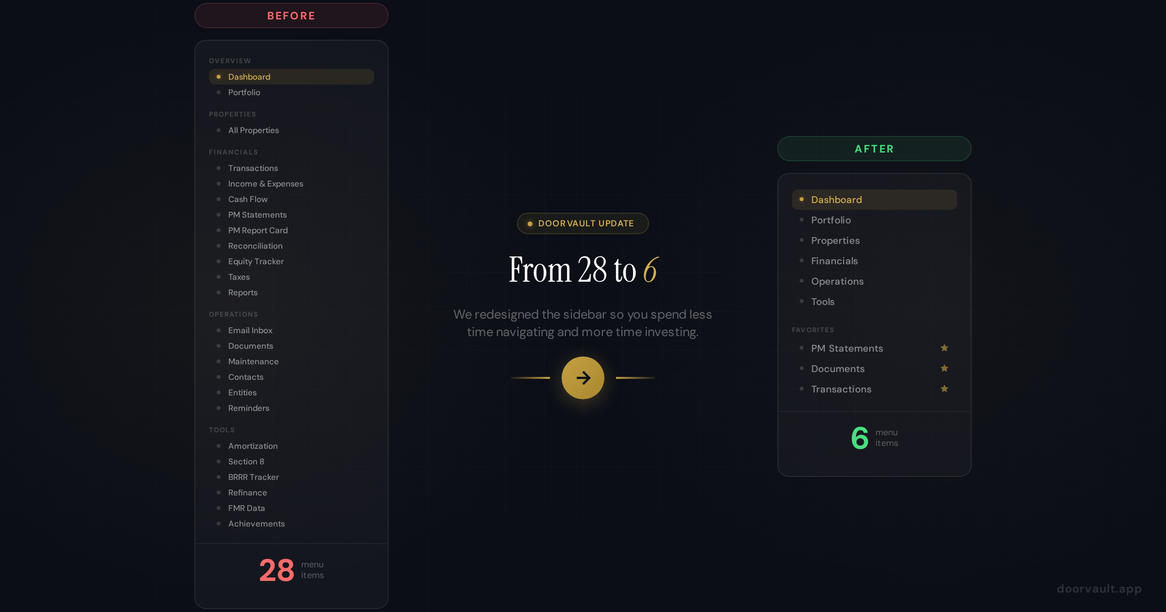
Before we knew it, the sidebar had 28 menu items spread across four sections. For power users who knew the app inside and out, this was fine. But for new investors signing up for the first time? It was overwhelming.
We heard it directly from real users: “I just want to check my cash flow and see my properties. Why do I need to scan through 28 options to find what I need?”
That feedback stuck with us. If your navigation makes users hesitate, you have a problem.
The Fix: 6 Groups, Tab Bars, and Favorites
We consolidated every page into 6 clean navigation groups:
- Dashboard for your portfolio snapshot
- Portfolio for the big picture (equity, entities, portfolio health)
- Properties for managing individual properties
- Financials for everything money related (transactions, income and expenses, cash flow, PM statements, taxes, reports, reconciliation, and PM report card)
- Operations for the system doing work behind the scenes (email inbox, documents, reminders, contacts, maintenance)
- Tools for calculators and analysis (amortization, Section 8, BRRR tracker, refinance, FMR data)
Click any group and you see a horizontal tab bar across the top of the page. Every sub page lives inside its parent as a tab. No more hunting through a long sidebar. Click Financials, then click the PM Statements tab. Done.
Nothing Was Removed
This is important: every single feature still exists. We did not delete a single page. We reorganized them into logical groups so you can find what you need faster. Every old URL also redirects to its new location, so your bookmarks and saved links still work.
Basic Mode vs Expert Mode
If you are in Basic mode, you see 5 sidebar items: Dashboard, Portfolio, Properties, Financials, and Operations. That is it. Clean and focused.
Switch to Expert mode and Tools appears as the sixth item. Inside each group, expert only tabs (like Cash Flow, Reconciliation, PM Report Card, and Reports) become visible too. The app grows with your experience level.
The Favorites System
Here is the personalization layer that makes this all click. Every tab has a star icon. Click it, and that tab gets pinned to your Favorites section at the top of the sidebar.
You can pin up to 8 favorites and drag them into whatever order you prefer. So if you check PM Statements, Documents, and Transactions every day, star those three and they are always one click away. Your sidebar becomes yours.
New users start with a few suggested favorites (Dashboard, Properties, Documents) so there is no blank slate confusion. You can swap them out immediately.
Property Detail Pages Got Tabs Too
When you click into a specific property, you now see tabs for Overview, Documents, Maintenance, Contacts, and Reminders. These used to be standalone sidebar pages that showed data across all properties. Now they are scoped to the property you are looking at.
The Documents tab inside a property shows only that property’s documents. Upload a file from here and it automatically associates with that property. The same Documents component also lives under Operations for the global view where you can see everything and do batch uploads.
Why This Matters
Navigation is not glamorous. Nobody signs up for a product because of its sidebar. But plenty of people leave a product because they cannot figure out where things are.
Going from 28 items to 6 means:
For new users, DoorVault feels approachable instead of intimidating. You sign up, you see 5 clear options, you know where to go.
For power users, the Favorites system means your most used features are always one click away. No scrolling, no scanning, no thinking.
For everyone, the tab bar pattern is intuitive. You already know how tabs work. Click a group, click a tab. The mental model is instantly clear.
Try It Now
The new navigation is live for all users. Log in and you will see the streamlined sidebar immediately. Star your favorite pages to build your personalized quick access bar.
If you have not signed up yet, create your free account and experience the cleaner DoorVault from day one. No credit card required.
We are always listening to feedback. If you have thoughts on the new navigation, just ask Knox or hit Send Feedback in your profile menu. We read every message.